
Mono-tone/ Monotony
- sharmabhakti
- Aug 1, 2025
- 5 min read
For centuries, it lurked in the shadows (all puns intended), but a few years back, it made a comeback louder than your neighbor's karaoke night. Fast forward a bit, and we're still splashing single colors all over the place like it's going out of style—except it's not. This wild ride is known as color-drenching. Some might say that all-white walls and ceilings are the OGs of color drenching. But let's be real, color drenching really kicks off when those white walls call it a day!


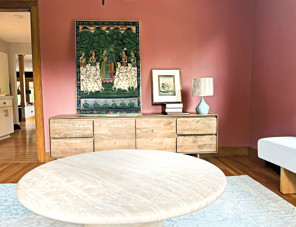
Formally, color drenching is an interior design technique where a single color (or very closely related tones) is used across multiple surfaces in a space — walls, ceilings, trim, doors, and even furniture, the works — to create a bold, immersive, and cohesive look. Color drenching loves deep jewel tones, soft neutrals, and bright & saturated hues. Navy blue for luxurious & moody spaces. and warm terracotta for energizing spaces remain our go-to hues when color drenching is an obvious choice for the space. In the wild world of interior design, color drenching is like throwing a monochromatic party where one shade gets to be the star of the show! !
So, how do we color drench and not color disast(er)?
FCFC: No, this is not a reference to football clubs. This is our beginner's color drenching thumb rule: Pick a favorite color for a fun corner. If color drenching for the first time, you need to be absolutely, completely, and unapologetically in love with the color to avoid painter's remorse. Now, pick a fun corner or a space that needs to be zhuzhed up. Laundry rooms, powder rooms, and stairwells are low-risk spaces to try color drenching before you commit to a space that you spend more of your time in.
Our go to for FCFC: entry hallways in jewel or earth tones... makes the space feel more nested
EXTRA/ EXTRA: Understand the play of color and how by making small tweaks such as brightness or intensity, lasting focus can be created. Layer up the space in a 70/30 ratio. 70% of the room can be in the dominant hue, and 30% of accent spaces can be in a shade, tone, or tint of the hue. (Footnotes: hue + black = shade, hue + gray = tone, hue + white = tint)
Our go-to for extra extra: Dead flat paint on the walls, trims in semi gloss

TEXTURE IS YOUR FRIEND, PATTERN NOT SO MUCH: When color drenching, a big do is to add texture to 1 or 2 surfaces in the room and paint it in the same hue as the space. Whether physical or visual, texture adds dimension and depth to the surface, thus creating visual interest. Use different finishes such as flat walls and semi-gloss trim to add subtle contrast within the same color. Rooms with molding are our favorite color-drenched spaces. Pattern, on the other hand, should be used in color-drenched rooms with discretion. While a motif or monogram in the dominant hue will work, pattern drenching in the dominant hue will get the color train off the rails in seconds. Color-drenched rooms are not the place to channel your inner Apfel (RIP, icon).
Our go-to for texture/pattern: When color drenching, the scale of a monogram/motif pattern should follow a 20/80 rule, where the motif only occupies 20% of the foreground and the background is 80% color.

FINISH IT UP: We love a good and natural full-bodied limewash paint in the same hue for an accent wall. Mixed with earth mineral pigments, the paint reflects light in a unique and beautiful way while the mineral surface breaks up incoming light and refracts it in every direction. This luminescence adds character and a glowing effect to every color-drenched wall.
Our go-to for finish it up: Limewash an accent or fireplace wall, add a sleek cove wall grazing lighting detail for extra oomph.

NEVER IN ISOLATION: The cardinal rule of design is to never pick an element in isolation. Color, texture, pattern, light, scale, and form should all be chosen in relation to their effect on each other and the space. The principles such as balance, contrast, emphasis, proportion, unity, and repetition help us decide how these elements should be arranged to achieve an aesthetic composition. Too complicated? Let's break it down in terms of color drenching. Think of the paint color in relation to the windows in the space and the lighting. Brighter and saturated colors work better in spaces where natural light is abundant, while softer hues will make a room with less light appear crisper.
Our go-to for 'never in isolation': Always test paint color under different light sources and test it both for day and nighttime views.

WHITE NOT, WASTE NOT: If you choose to color drench in white, we can arrange that too. Just understand your whites really well or ask us. We understand the underlying tone and natural reflection of ambient hues and the dance of color and light.
Our go-to for White not, waste not: We often pick the whitest white Chantilly Lace in Flat with a White Dove trim. For application, this is not for the faint of heart, but pretty things seldom are.

On paper, one might think covering the whole space in one color seems overwhelming. Au contraire, if done right, color-drenched rooms have the ability to create a tranquil theatrical space, one that blurs the edges, thus making rooms feel larger or more unified. It is the easiest way to simplify visual clutter on a budget. Remember the number one rule of painting: test a sample on the wall in a room, preferably on a primed surface. View it during the day, view it at night. Sit on it before you say yes to the paint.

And when you are ready, paint it all red (read: metaphor), the radiators, and the trims, and the ceilings, and the walls, and the whole nine yards.


Comments